Choosing the right colors for your gallery wall art can be a daunting task. With so many different decisions to make - from which shades to use, to what tones of each color look best together - it can be hard to know where to start. In this article, I will provide you with 8 tips that will help you mix and match colors on your gallery wall art, so that you can finally create that perfect look!
Tips for Mixing Colors
When it comes to mixing colors in your gallery wall art, there are a few things you can keep in mind to create a cohesive and stylish look. First, consider the overall color scheme of your room. What colors are already present that you can work with? If you're starting from scratch, think about what colors complement each other and which ones you want to use as accent colors.
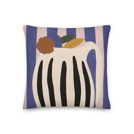
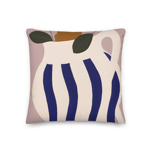
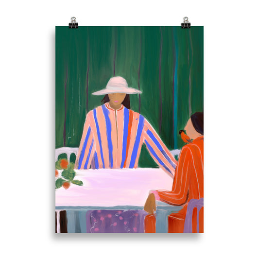
Once you have a general idea of the colors you want to use, it's time to start thinking about how to mix and match them. One way to do this is by choosing artwork that contains multiple colors within the same piece. This can help tie everything together and add interest to your gallery wall. Another option is to choose artwork with similar color schemes but different styles. For example, if you're using mostly blue and green tones, try mixing abstract and realistic pieces together.
Finally, don't be afraid to experiment! Try out different color combinations until you find something you love. And remember, there's no right or wrong way to mix and match colors - it's all about what looks best to you.
Examples of Different Color Combinations
When it comes to gallery wall art, there are endless possibilities for color combinations. Here are a few examples to get you started:
Monochromatic: This involves using different shades of the same color. For example, you could use various shades of blue or green. This is a great option if you want a cohesive look.
Complementary: This involves using colors that are opposite each other on the color wheel. For example, you could use blue and orange or red and green. This is a great way to add some contrast to your gallery wall art.
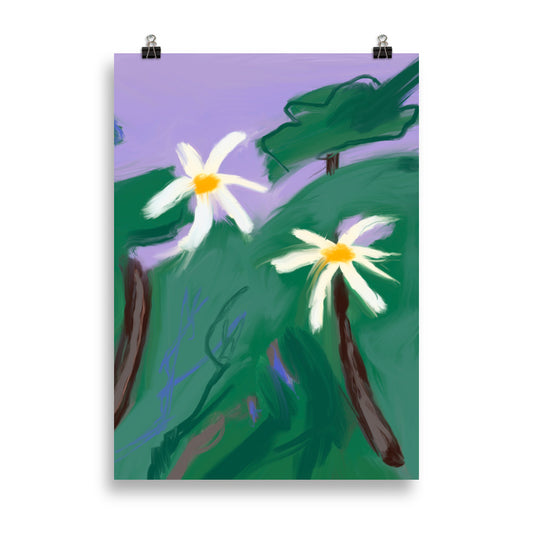
Analogous: This involves using colors that are next to each other on the color wheel. For example, you could use green and yellow or blue and purple. This is a great option if you want a harmonious look.
Colors to Keep in Mind When Mixing Colors
When it comes to mixing and matching colors on your gallery wall art, there are a few key colors to keep in mind. First, consider using a mix of light and dark colors to create contrast and interest. Second, try to use a variety of complementary colors to create a cohesive look. And lastly, don’t be afraid to experiment with different color combinations – you may be surprised at what looks great together!
Conclusion
With these 8 tips for mixing and matching colors on your gallery wall art, you should be able to create a beautiful and unique display that will draw in guests and give them something interesting to look at. Have fun with the process of creating a design, but also take time to consider all of the elements involved. By taking the time to plan out your gallery wall art ahead of time, you can ensure that it looks cohesive and visually appealing. Good luck!